PassItForward

A community-driven platform that makes giving away unwanted items as effortless as selling them — built around trust, neighborhood connections, and reducing uncertainty throughout every stage of the exchange.

My Role

• Competitive Analysis

• User Interviews

• Journey map

• Ideation

• User Flow

• Wireframes (Post Feature)

• Mid-Fidelity Prototype (Post Feature)

• High-Fidelity Prototypes

(Post Page)

• Usability Testing

Timeline

3 months

September 3 – November 28

Team

UX , Product, and Research Teams

Overview

PassItForward: A community-driven platform for giving away unwanted items

PassItForward is a community platform designed to make giving away items as effortless as selling them. Rather than creating another marketplace, we designed PassItForward around three core principles: build trust first, encourage neighborhood connections, and reduce uncertainty throughout every stage of the exchange. The project followed a full UX process from research through high-fidelity prototype and usability testing.

Problem Statement

The process for giving away unwanted items presents potential struggles and risks that can largely surround trust and safety, which in result generates excessive waste that could be prevented

Why should we care about this?

🗑️
Consumer goods make up 37% of all American trash, including furniture, appliances, and clothing.
EPA
♻️
Only about 15% of used clothes and textiles in the U.S. get reused or recycled — most ends up as waste.
NIST
⚠️
1 in 3 listings on Facebook Marketplace could be a scam, leaving safer alternatives missing.
TSB Bank, 2023

Solution

Interactive Prototype
A trust-first community giving platform

Process

Okay but wait....how did we get here?

Phase 1
Research
Competitive analysis + 5 user interviews
Phase 2
Define
Persona, journey map, HMW, ideation
Phase 3
Design
User flow, wireframes, visual design, high fidelity
Phase 4
Validate
Prototype + usability testing with 5 tasks
Phase 5
Reflection
Lessons learned + future direction

Competitive Analysis

Most competitors only addressed one part of our problem when it came to giving away items

Before designing PassItForward, we analyzed existing community and marketplace platforms to understand how people currently give away unwanted items. We evaluated competitors based on community, trust, and ease of rehoming to uncover opportunities beyond feature comparisons.

Can feel trustworthy (largely community based) but is very unstructured and informal

Provided more structure and intentionality, but largely felt transactional/can be risky

Intentions towards being community based and structured, but not accessible

User Interviews

We interviewed 5 participants with experience buying, selling, donating, or picking up secondhand items to understand how people navigate local exchanges.

We wanted to understand: why people donate instead of sell, what influences trust, pickup frustrations, safety concerns, and communication habits.

User 1
👩🏽
User 2
🧑🏻
User 3
👨🏾
User 4
🧑🏼
User 5
👩🏻
We Asked About
🕰️Past experiences
💸Selling vs. donating
📦Pick-up preferences
🤝Seller trustworthiness
🛡️Safety concerns
Example Questions
"When deciding to rehome an item, how do you choose whether to sell, donate, or give it away for free?
"What factors do you consider before deciding to claim or buy an item — condition, location, trust in the seller?

Insights

0+
Data Points
0
Categories
0
Themes
...later
"

There needs to be some type of buyer protection and a way to verify people

Many interviewees voiced having trouble trusting users online

"

My preferred method is local meetup. It can feel unsafe doing porch pick up at times — a local meetup is more supervised

Common concerns include the actual transaction experience safety

"

The price, the pictures, the quality, and the seller's profile — if they seem safe, have previous items they have sold

Reassurance about item quality heavily influences behavior — users won't pursue pickups unless they think it's worth the effort

Journey map

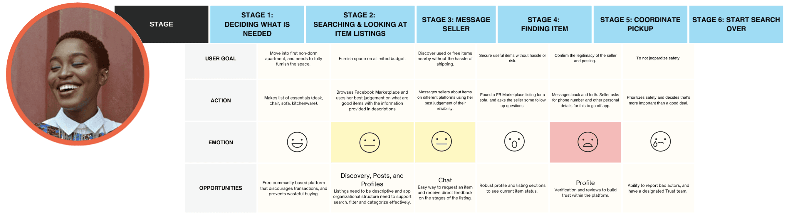
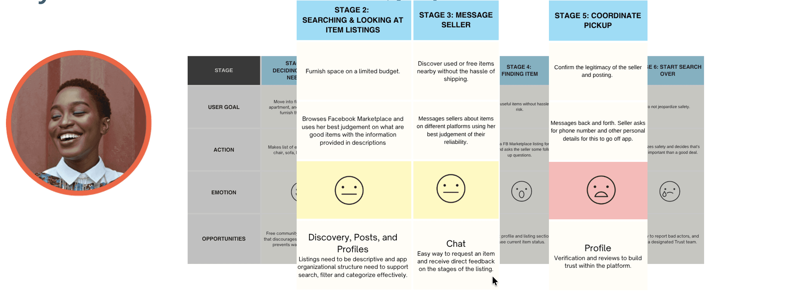
Users were encountering these pain points in 3 major stages of their journey, being when they are searching and looking for item listings, when they are messaging donators, and when they are coordinating pickups

We mapped the complete journey — from deciding to give away an item to completing pickup — to identify where uncertainty prevented users from following through. Anxiety peaked during communication and pickup. Small uncertainties accumulated throughout the experience. Users needed confidence more than convenience. These findings shifted our focus away from improving discovery alone and toward reducing uncertainty through verification, richer listings, reputation systems, and simpler pickup coordination.
StagesPain Points

How might we & IDEATION

How might we provide verification when it comes to users, transaction experiences, and items in the most effective way for platform users who want to give items away — in order to reduce waste and support the recycling of items.

👤
Verify
Users
🤝
Verify
Transactions
📦
Verify
Items

ideation

Starting from the friction points surfaced in research, we generated a range of ideas to address uncertainty at each stage — from initial discovery through post-pickup accountability. We aimed for quantity before converging on the concepts most aligned with our core principle of building trust first.

👤
People Verification
Getting started flow: Identity verification at sign up
Pop blocker to verify account
Driver's license & home address upload
📦
Item Verification
Posts: Detailed item description selections
Post status (active, pending, gone)
Post tags & categories (furniture, compact, etc.)
Post images & videos
Post location for pickup
🤝
Transaction Verification
Chat flow: In-app transaction coordination
General location meetup recommendations
Select & confirm pickup arrangements
Planned location, time, and live ETA
Person appearance preview
Community Trust
Profiles: Community reviews and earned badges
My Friends network
Trusted seller indicators

USER FLOW

Designing the flow around trust checkpoints, not just task completion.

Rather than optimizing purely for speed, we structured the user flow to surface trust signals at each critical moment — before browsing, during discovery, when messaging, and after pickup. The flow was intentionally designed to allow users to: verify identity, discover items confidently, coordinate pickup with clarity, and build reputation over time.
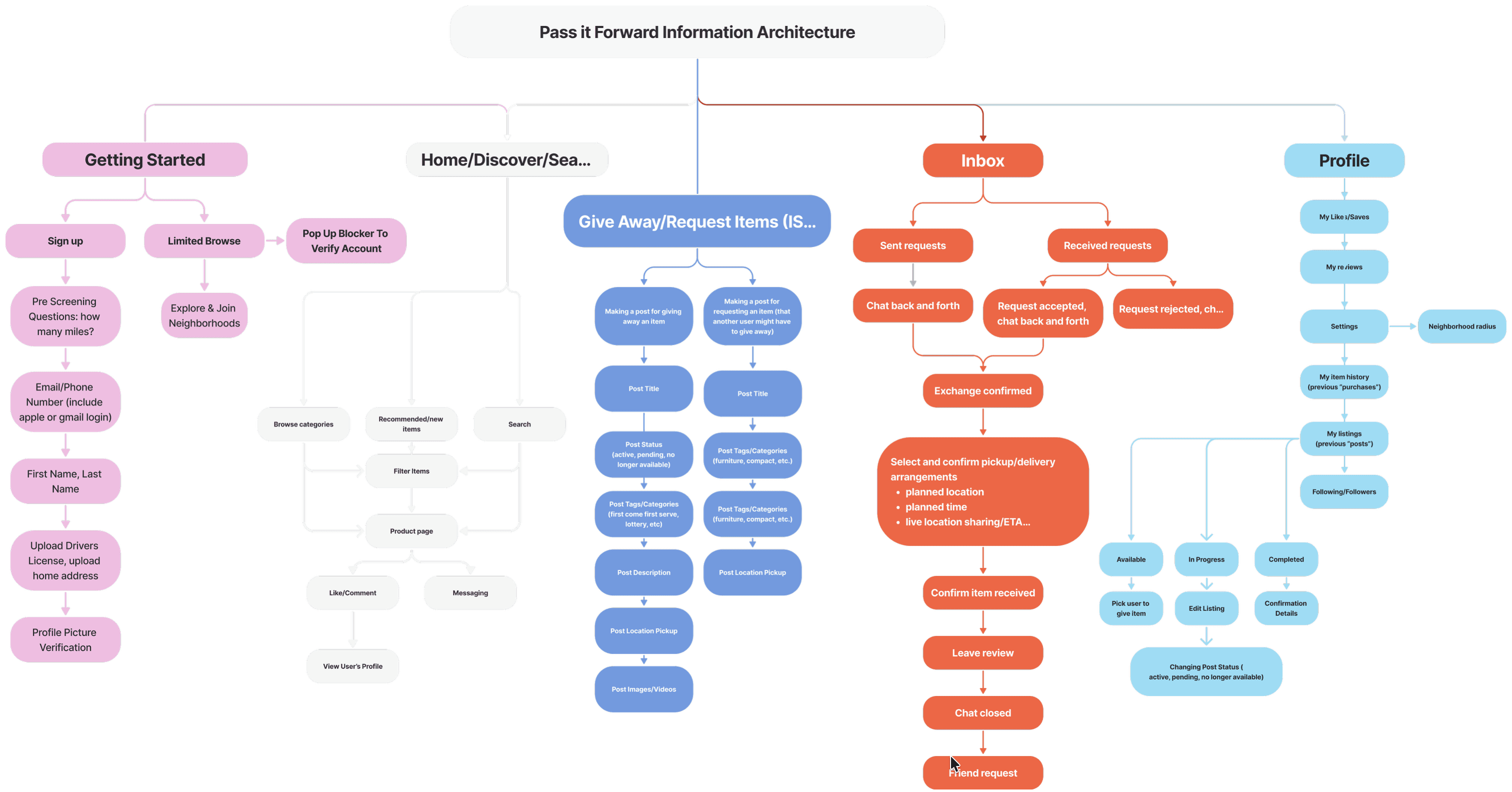
User Flow
Click to expand
Click to view in detail

WIREFRAMES & Mid-fidelity

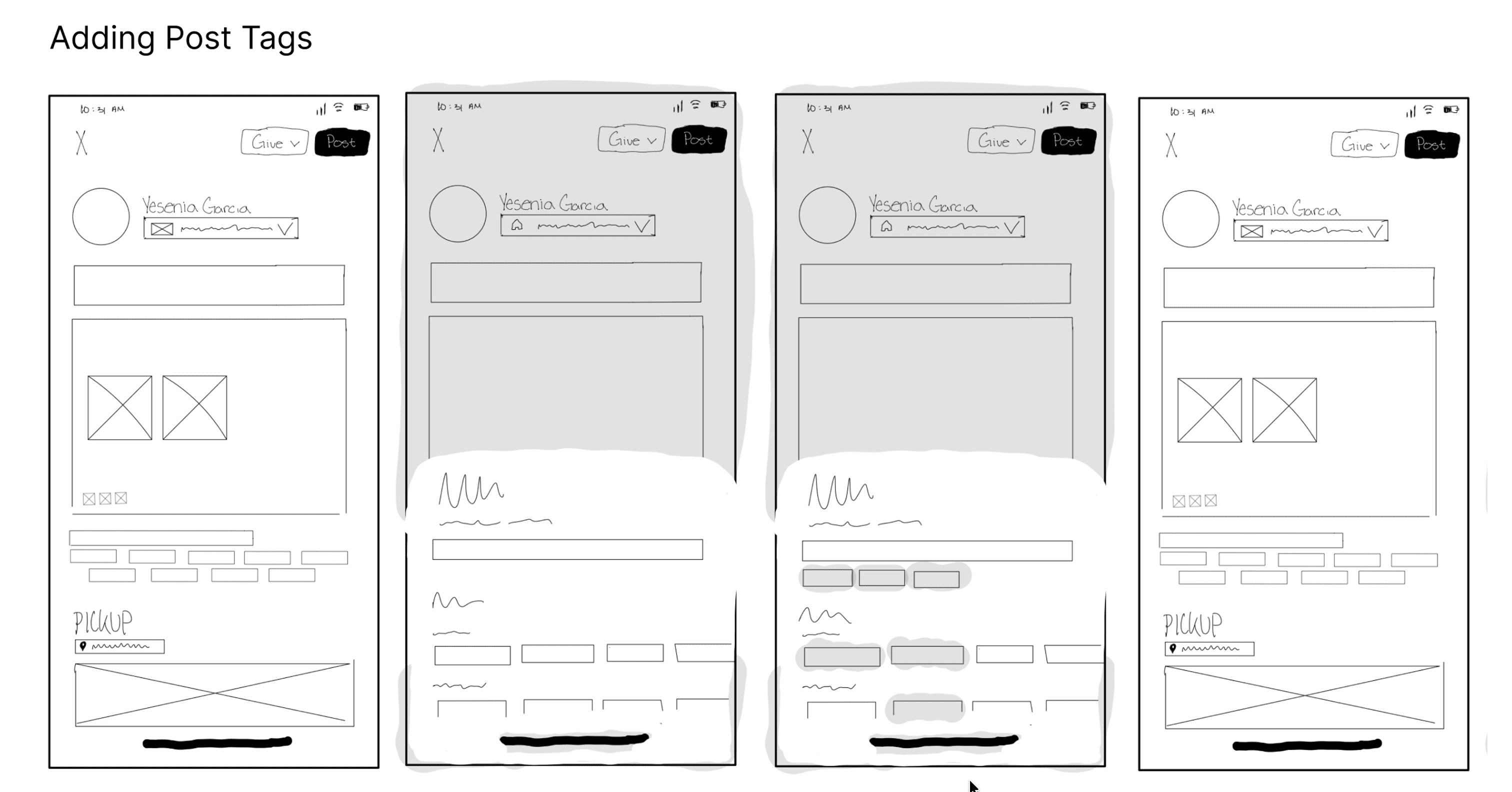
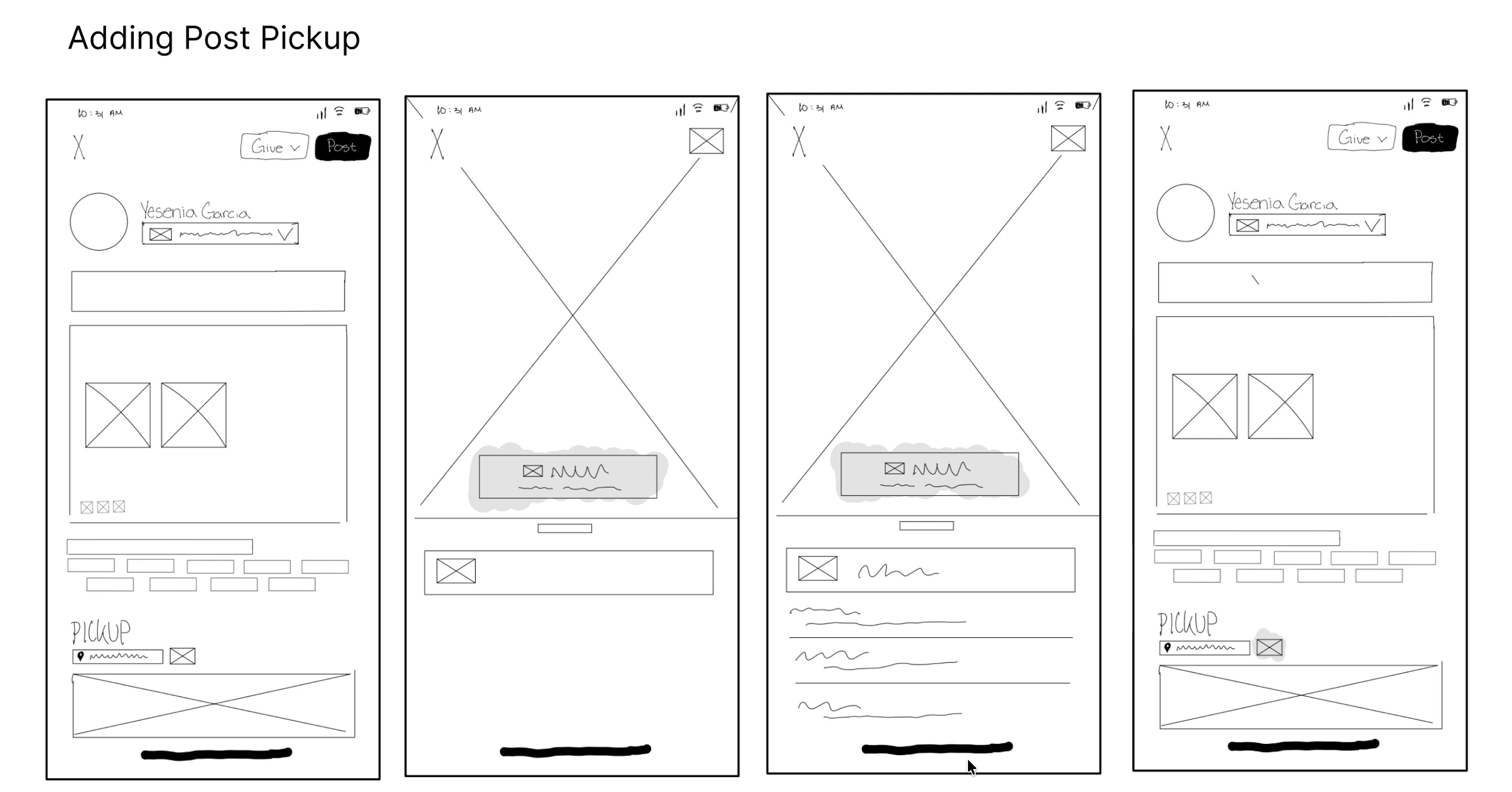
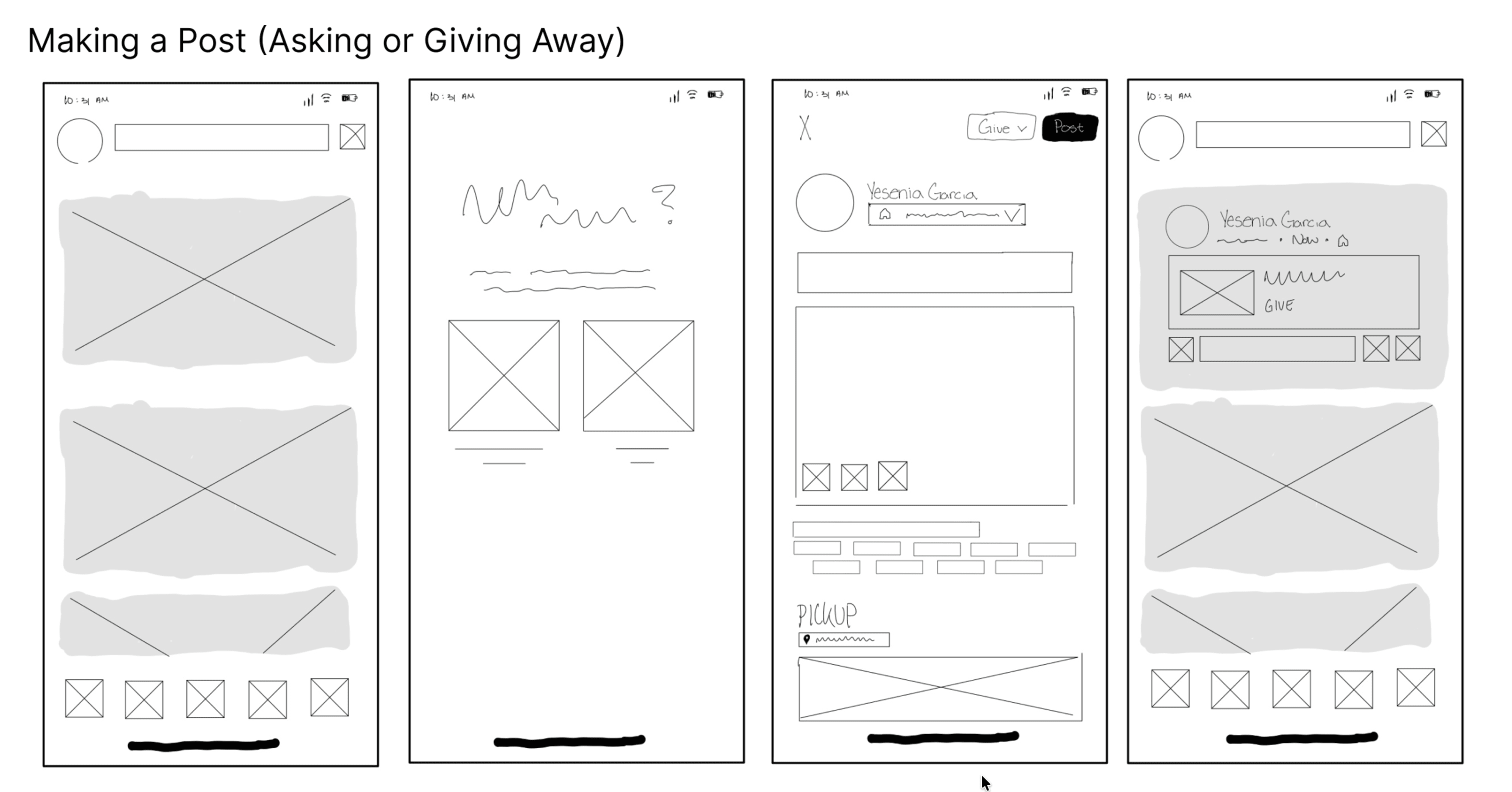
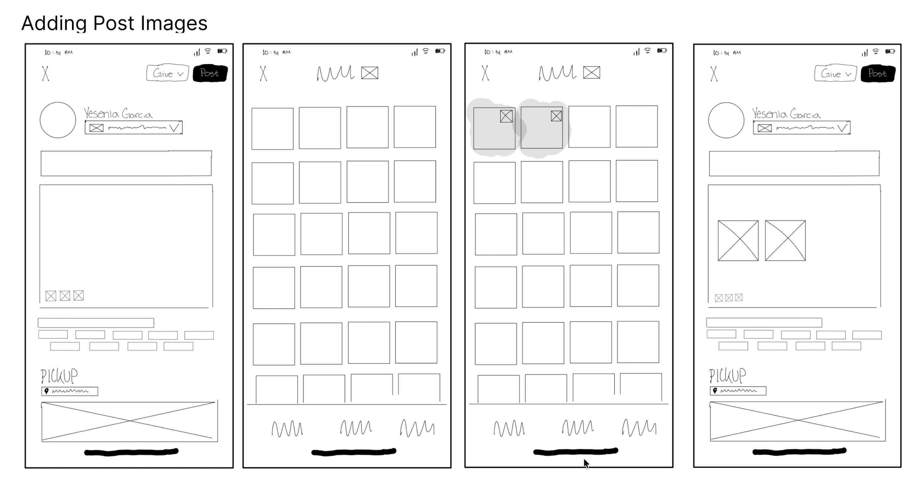
Designing a post creation experience that naturally incorporates detailed item description selections

And so when moving into wireframing, I wanted to reflect how a user would go about adding a listing to a free marketplace app (so selecting whether it would be a give or ask listing, adding post images, selecting general location area for the pickup, etc.), and I wanted to do this in order to maintain the industry standard, but while naturally incorporating features that would allow for more detailed item descriptions
Task 1
Browse nearby items
Task 1
Task 2
Post an item
Task 2
Task 3
Message another user
Task 3
Task 4
Coordinate pickup
Task 4

VISUAL DESIGN

Designing for Confidence

Our visual language was intentionally designed to balance friendliness and trust, reinforcing the community-driven nature of the platform while helping users feel confident completing exchanges.

Design Principles: Community · Transparency · Simplicity
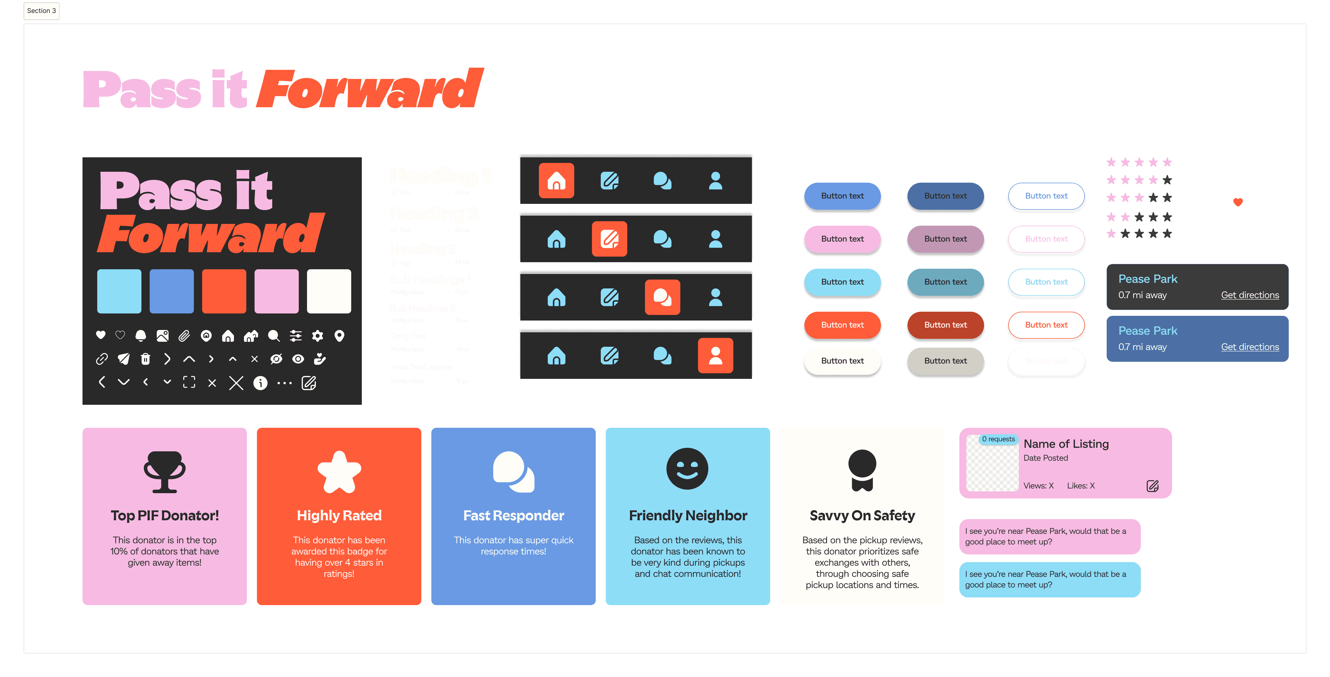
Visual Guide
Click to expand
Click to view in detail

high-fidelity

Post Creation

PassItForward

A trust-first community giving experience.

USABILITY TESTING

Goal: Validate whether our trust-centered experience helped users confidently complete common tasks.

We wanted to understand: why people donate instead of sell, what influences trust, pickup frustrations, safety concerns, and communication habits.

Round One
Total Testers
5
P1·27F
P2·29F
P3·32F
P4·21F
P5·22M
In-Person Testing
Round Two
Total Testers
7
P1·35F
P2·34M
P3·34F
P4·24M
P5·22F
P6·26M
P7·29M
UserTesting.com
Round Three
Total Testers
8
P1·43M
P2·45M
P3·23F
P4·29F
P5·24M
P6·25M
P7·24M
P8·31M
UserTesting.com
Overall Testing Demographics
20 Total Testers
Usability Testing Focus
Post creation flow completion
💡Feature clarity & helpfulness
Friction in the experience
🔄Comparison to existing tools
Example Scenario
"You're a UT student living in West Campus near the Orange Market. One day you decide to make a post on PassItForward because you want to give away a kitchen ladle you accidentally bought too many of when you went to the store recently. Make a post that is shared to nearby neighborhoods with 2 relevant images and 3 tags.

Insights

Round One
Larger Issue
After my first round of testing, the Post Creation concept resonated with users, but the usability wasn't entirely there.
Images felt like an afterthought — so I moved them to the top with social-media inspired emphasis
What We Saw
Users mentioned that image visibility felt like an afterthought in an application trying to prioritize descriptive listings. After adding an image, it would simply show up under the description box — because I was initially prioritizing the description box.
How I Addressed It
I addressed this by drawing inspiration from social media platforms that demonstrate strong imagery and description, emphasizing and focusing images at the top of the listing.
Round Two
Smaller Issue
After the second round of testing, there were still minor usability comments — but this time, less critical.
Button color variants caused confusion in dark mode — so I switched selected states to light
What We Saw
Users felt that the colors used for default and selected buttons were unintuitive and caused confusion — going from light to dark when selected, which conflicted with the dark mode interface.
How I Addressed It
Considering our approach for a dark mode application, I reviewed industry-standard patterns for dark mode interfaces and addressed this by switching the variants — making selected buttons light instead.
Round Three
Validated
By the last round of testing (with our larger group of users), there were little to no critical comments on post creation usability.
Users compared post creation favorably to Facebook Marketplace — some even thought ours was better
What Users Said
Most mentions surrounded comparisons to Facebook Marketplace's user experience for post creation. Some users appreciated the similarity to it — others believed our experience was actually better.
User Quote
"Feels better than what I'm currently using. Especially better than Facebook... This really does a great job of streamlining the process."

REFLECTION & NEXT STEPS

🔄
Biggest Shift
Sustainability wasn't the real motivator
I began this project believing sustainability would be users' primary motivation. Research showed that trust and convenience mattered far more — fundamentally changing how we approached the product.
💡
Biggest UX Lesson
Trust isn't one feature — it's dozens of small decisions
Every screen, label, and flow state was an opportunity to either increase or erode user confidence. Trust gets built (or broken) in the tiny moments between actions.
🔭
Looking Forward
Focusing on what most influences successful exchanges
I'd focus on validating which trust features most influence successful exchanges and exploring ways to further simplify pickup coordination — the highest-anxiety moment in the experience.
Where I'd Go Next
Two directions I'm most excited about
🤝
Trust deserves more attention
Deepen trust + verification features
Research which specific verification and reputation signals — badges, reviews, community endorsements — most influence whether an exchange actually gets completed. Trust is the product; it's worth getting precise about.
Designing for everyone, not most
Push accessibility toward WCAG AA — and beyond
Audit color contrast, focus states, screen reader flows, and keyboard navigation to reach WCAG AA (and ideally AAA) standards. A community-driven platform only works if the whole community can actually use it.

Keep reading...

iMajor

UX Design