iMajor
A networking/social media application for both current and prospective UT college students undergoing the major-deciding research process to connect them to individuals with first-hand experience

My Role
• Project Founder
• Contextual Inquiry
• Interview Protocol
• User Interviews & Analysis
• Concepts & Storyboards
• Paper Prototypes & Design Rationale (Search Page)
• Wireframing & User Testing
• High-Fidelity Prototypes
(Search Page)
Timeline
3 months
September 3 – November 28
Team
UX , Product, and Research Teams
Overview
iMajor: A networking major-assistance mobile application
As a response to the struggle that surrounds choosing a college major, our team of five University of Austin students designed iMajor as a networking/social app meant to connect current or prospective college students from their college (in this case UT) in order to get realistic insight on a degree and what it can offer from individuals who have already experienced it.
Problem Statement
Academic decisions, like that of choosing a major, can feel overwhelmingly binding when considering one's time, money, passions, and potential future.
The concept of choosing a career path to focus on for 2–4 years without knowing how to consistently weigh the options to choose the "right" path can result in extended degree completion, insufficient funding, and unnecessary stress. How can college students make a more informed and assured decision?
Why should we care about this?
Solution
A networking major-assistance mobile application
The Search Page
The search page allows users to either discover potential field interests through lists of alumni, students, majors, minors, etc. (best for users without a good idea) as well as tailor to specific field inquiries through the search box in order to get a "bird's eye" view of all the information provided regarding that specific field (best for users with an idea).
Latest Design
Original Design
Process
Okay but wait....how did we get here?
Interviews
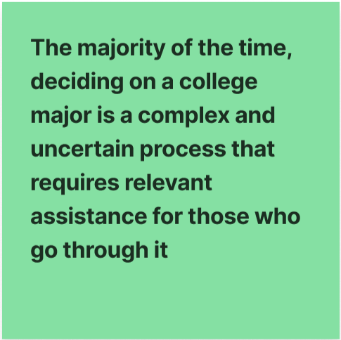
The main problem identified was that the process of choosing a major isn't simplified enough!
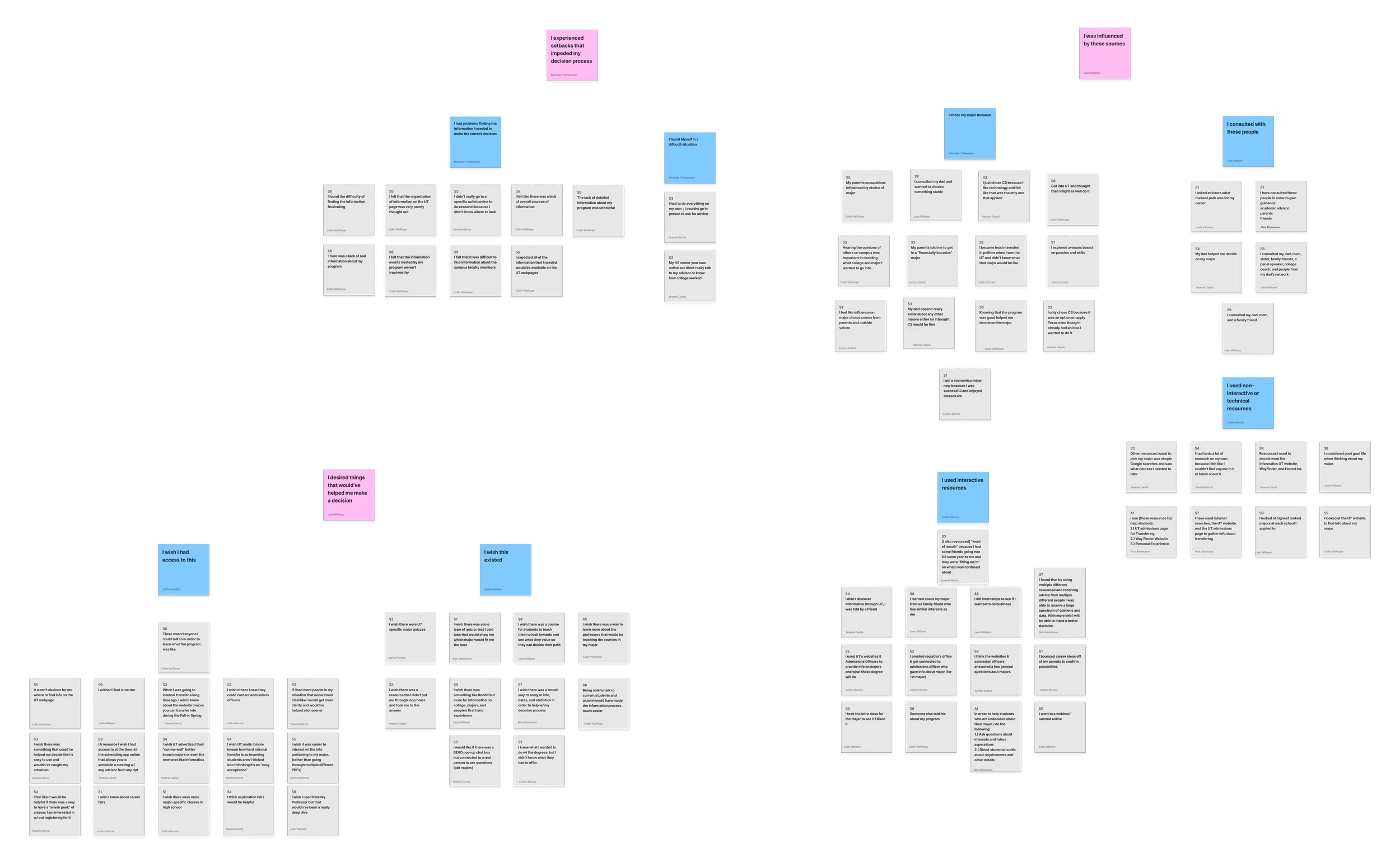
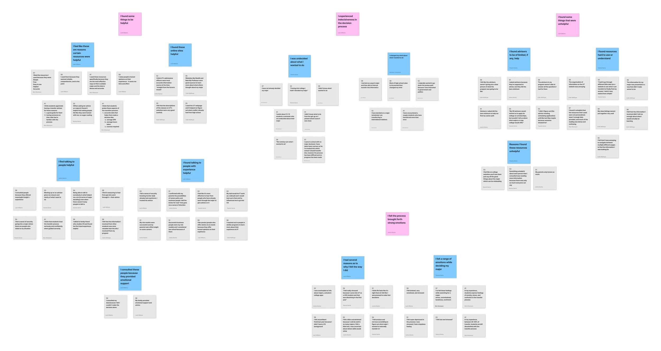
To understand how students navigate major selection, we interviewed 25 participants including prospective students, current UT students, transfer students, and even alumni and educational advisors as we wanted to take into account participants at different stages of the decision-making journey to uncover how needs evolve over time.
Insights
Key pain points
🗂
Information exists but it's fragmented
↓
Resources exist but are scattered across multiple platforms, making it overwhelming and hard to navigate.
👥
Students rely on people more than official resources
↓
Students were often and commonly heavily influenced by friends, family, alumni, advisors, and even academic departments over official materials.
🔍
Students want exploration & targeted research
↓
Students needed both open-ended exploration when uncertain and targeted, specific searches when they had a direction in mind.
Stakeholder Map
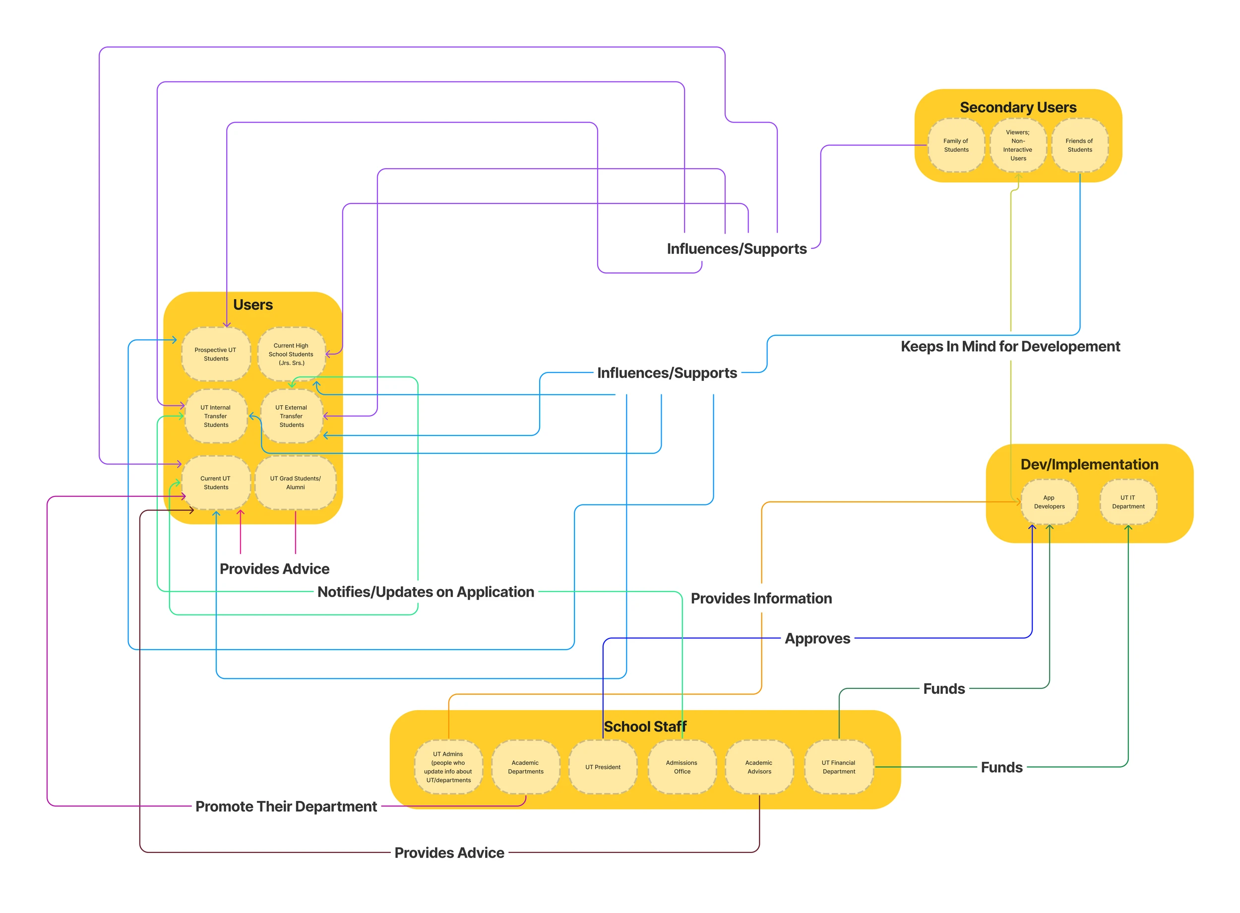
Stakeholder mapping revealed that Insight #2 (Students rely on people more than official resources) was most critical & became the focus of our solution
We identified all entities whether individuals, organizations, or resources that directly or indirectly assisted in the major selection process to better understand what is already out there and what we could bring to the table. It became evidently clear that major selection was not an individual decision. Students were often heavily influenced by friends, family, and alumni.
Individual Ideation
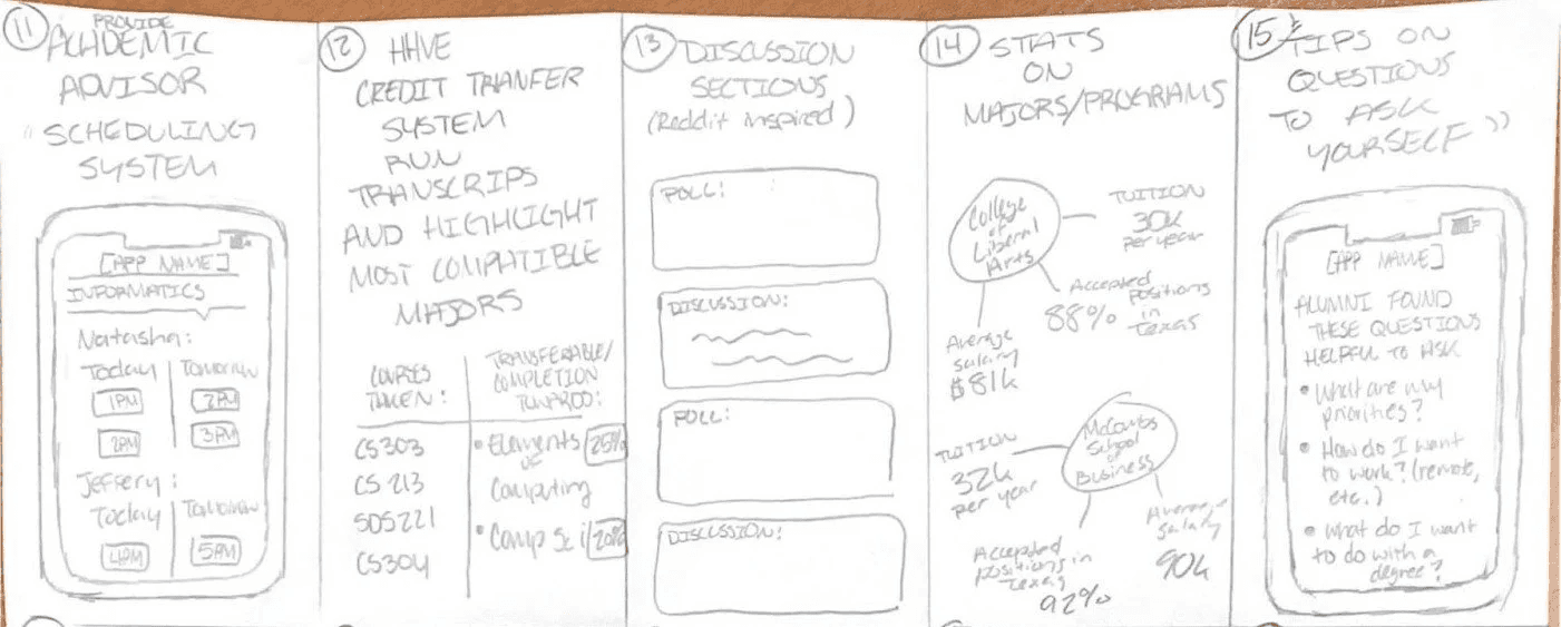
Crazy 20's ideation populated ideas like reach-out recommendations, networking scheduling systems, and even a Bevo chatbot (our mascot)
After understanding the perspective of our users and the already existing resources/approaches that assists them, we created 2 personas based on our research to design for the ultimate users that we are addressing. Although both users were choosing majors, their information needs were very different — preventing us from designing a one-size-fits-all experience.



Group Ideation
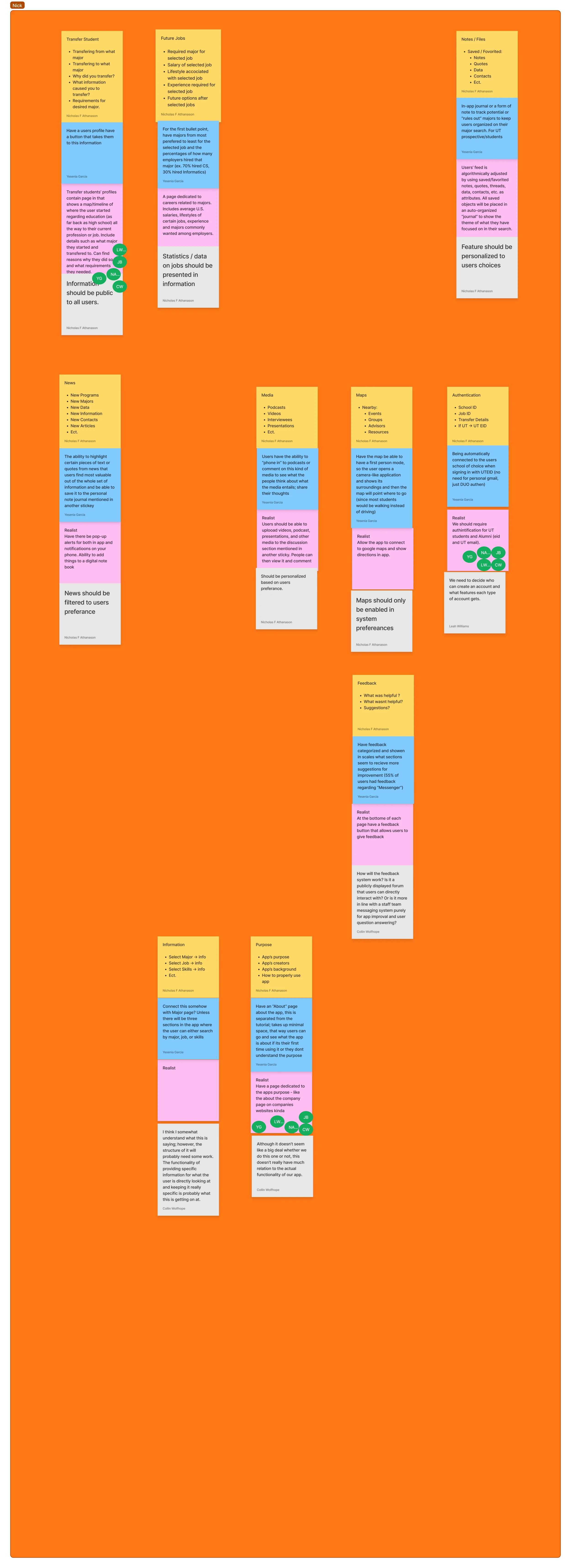
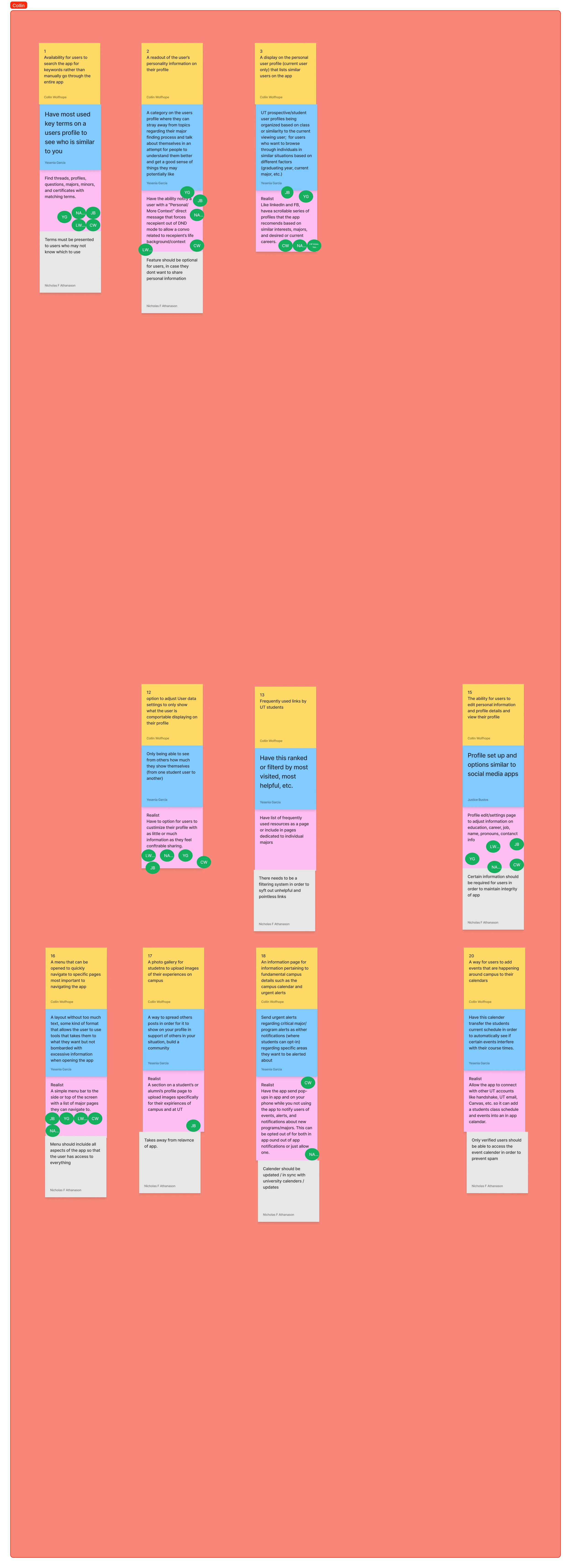
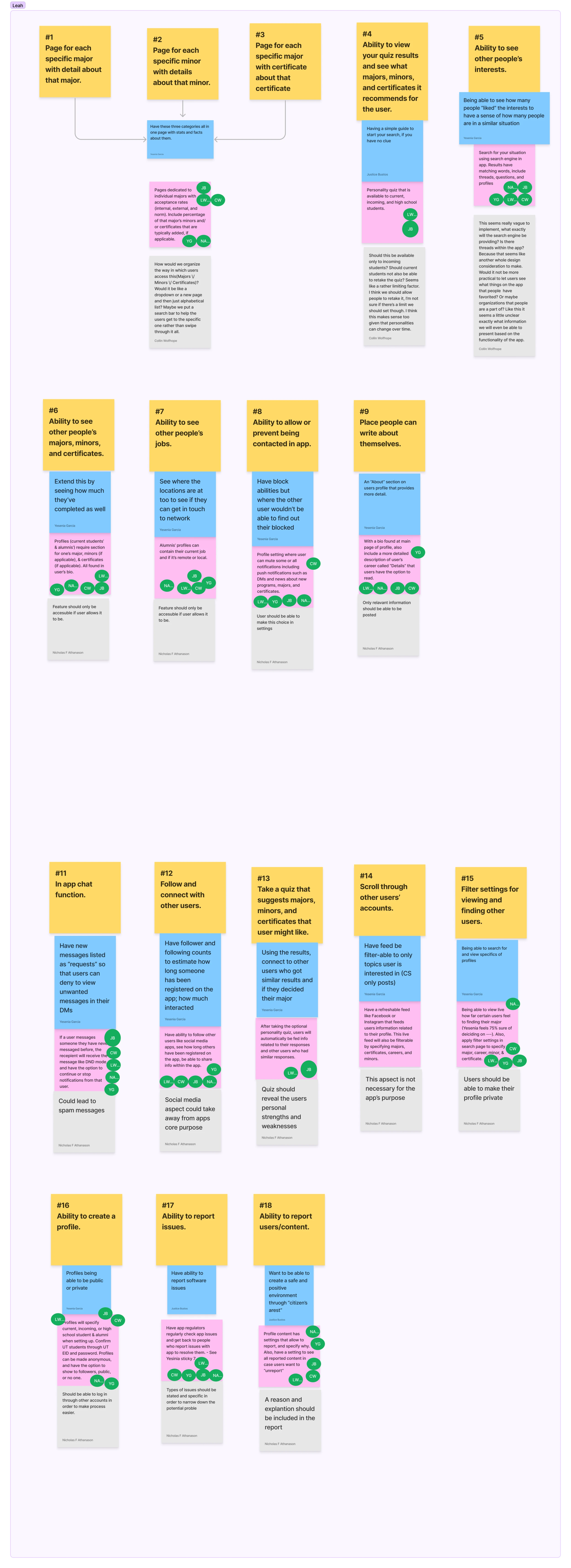
Considering the strong directions of our different ideas, we leveraged the Disney Creative Strategy framework that helped us land on an "Information Hub," a "Networking/Profile System," and a "Advanced Search Experience"
The team split up into 4 themes (Dreamer, Realist, Critic, Duplicates) for the most condensed ideas for iMajor. As we started to collaborate, we started to notice an alignment with the strongest feature concepts that consistently addressed the three key interview findings, bringing us to the 3 features that were combined into a single ecosystem to best support users all in one place.


Insights
Which we made sure ultimately reflected our research
🗂
Information exists but it's fragmented
↓
Difficulty finding reliable information
→ UT Information Hub
👥
Students rely on people more than official resources
↓
Reliance on other people's experiences
→ Networking/Profile System
🔍
Students want exploration & targeted research
↓
Lack of awareness of available majors and opportunities
→ Advanced Search Experience
Storyboarding
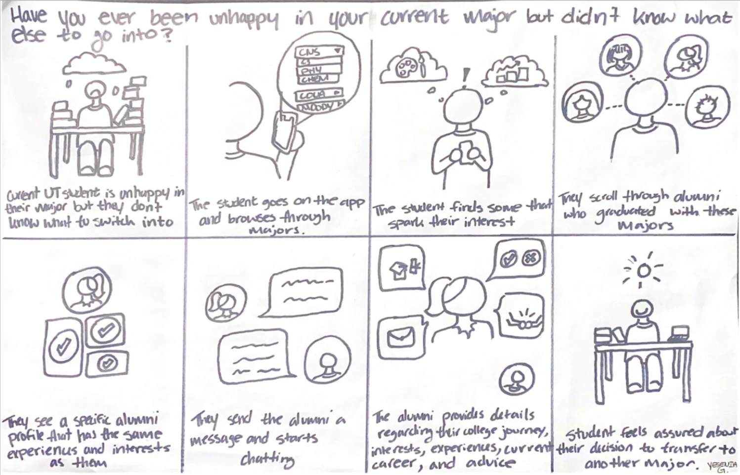
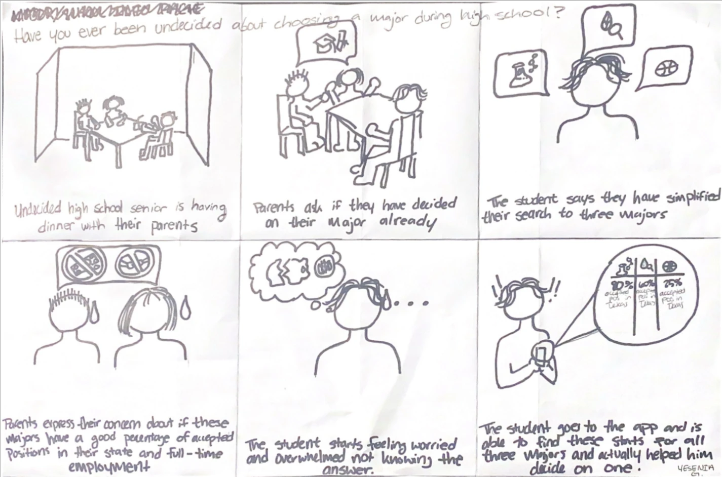
To validate whether our concepts fit naturally into real student decision-making scenarios, we moved to storyboards that reflected what our users were experiencing.. and conceptualizing where we come in
Have you ever been unhappy in your current major, but didn’t know what else to go into? Have you ever been undecided about choosing a major during high school?
For each of the top 3 feature concepts, we made 2 storyboards showing alternative tasks or personas with the goal to create content that describes the design idea and rationales clearly that reflect the real life experience of our users.
User Flow
But now having our features conceptualized and solidified, our challenge was balancing exploration with information overload in our user flows
Especially when it came to the feature I was in charge of, the search user flow was intentionally designed to allow users to discover information, evaluate options, connect with people, and save information for later.
Therefore, we decided rather than guiding our users through a linear process, we created multiple entry points to reflect our interviews where students entered the major-selection journey at very different stages.

Paper Prototypes & Wireframing for Mobile App
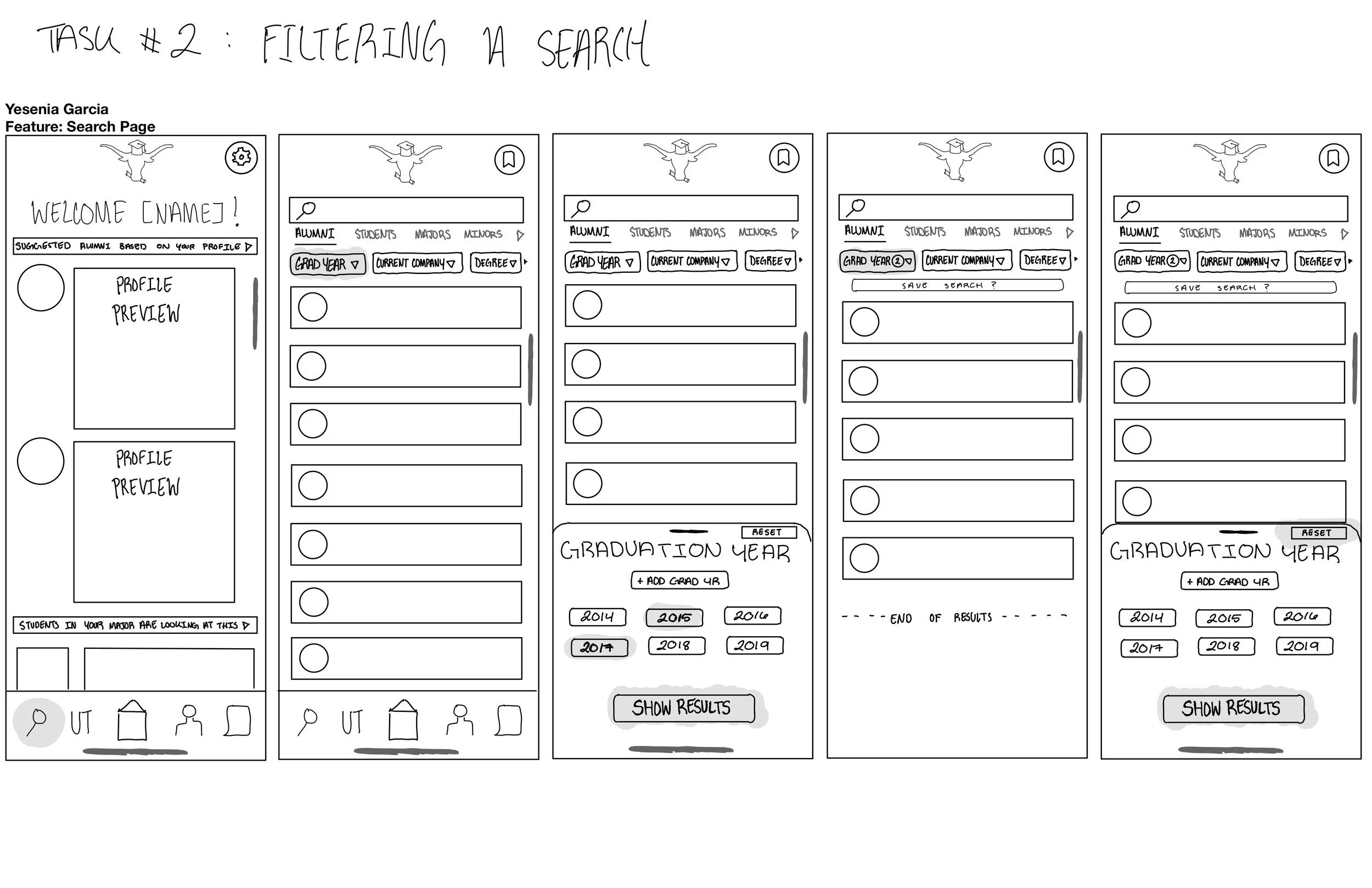
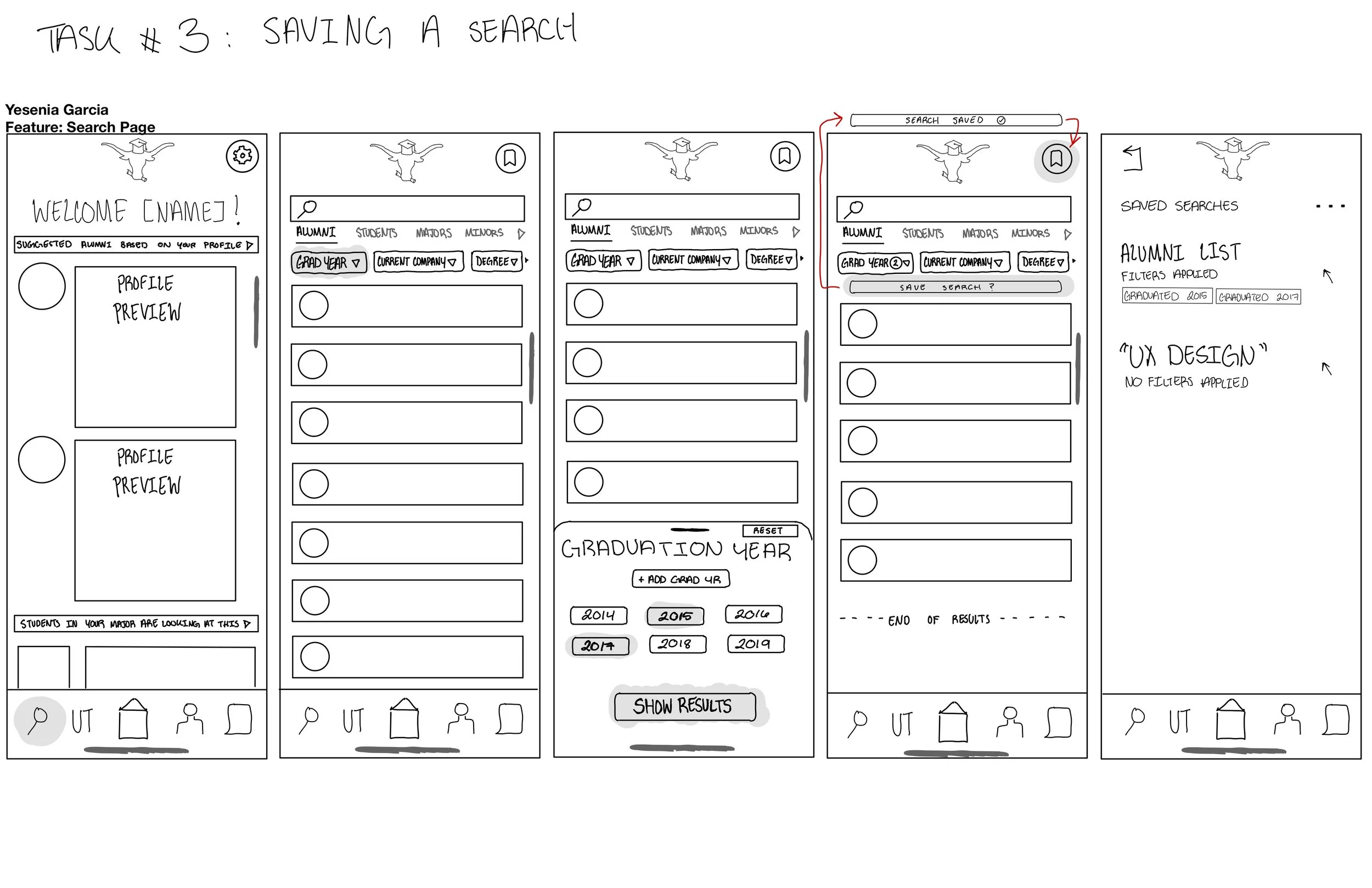
To get the most out of user testing, we brainstormed 4 detailed conceptual wireframe flows based on our user flows at aims of first understanding can users understand the overall concept? Does the information architecture make sense? Are the proposed features discoverable?….


Low-Fidelity Prototypes
…and then after the wireframes allowed us to evaluate how research findings could be represented in a realistic product experience, we translated them into low-fidelity to run by potential users!
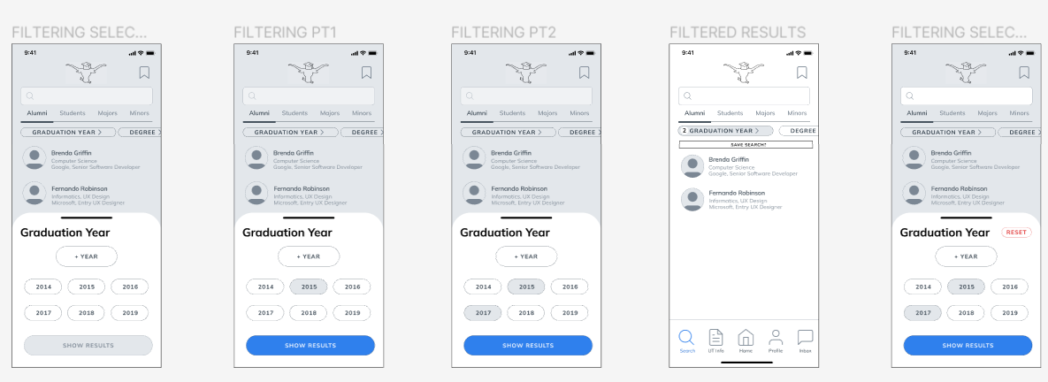
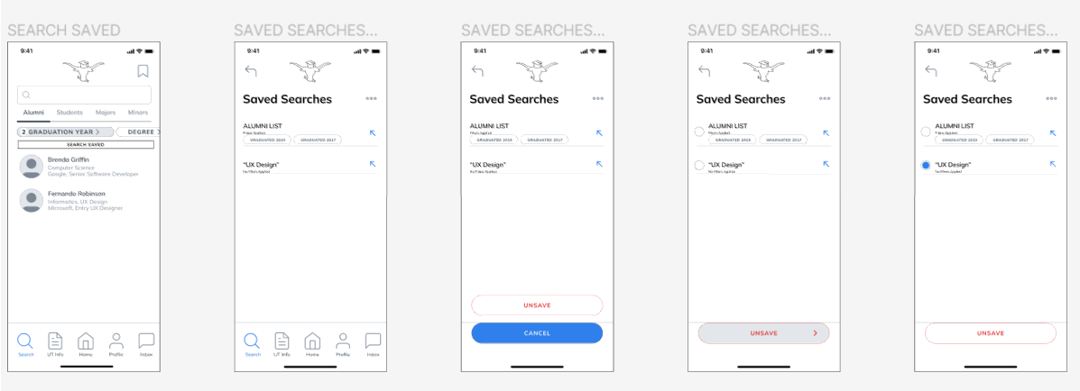
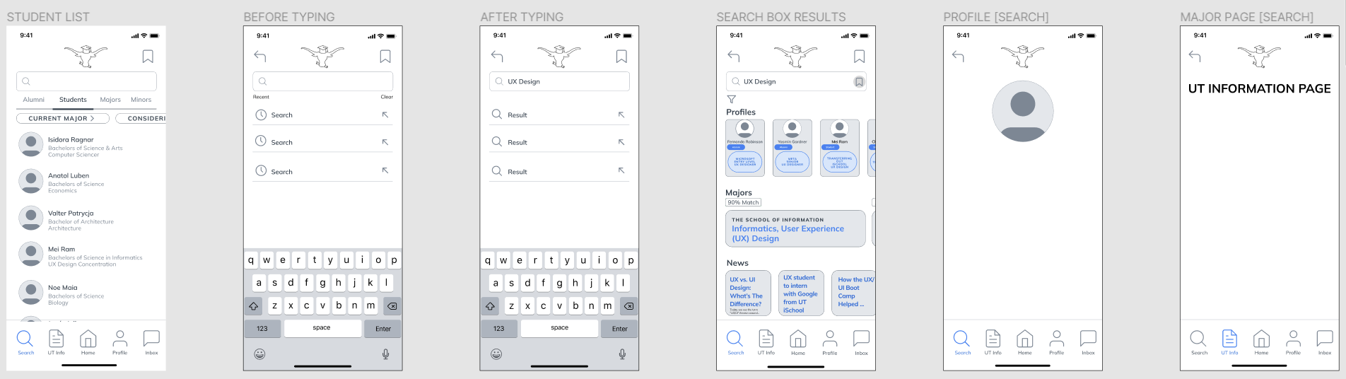
Wireframe prototypes have at least 3 tasks and each task includes at least 5 interactions designed in the previous assignment with focus on the user flow. The screens illustrate what tasks can be done and how in order for the users to participate in our user study and use the prototype on their own.

Recruiting Participants / User Testing
Now having interactive low-fidelity flows, we conducted usability testing with participants representing different academic backgrounds and levels of certainty regarding their major choice through a Think-Aloud Protocol
A Think-Aloud protocol involves involves the interviewee going through the steps of the tasks that the team member gives them and speaking about their thoughts as they work, this encourages our participants to talk when any thoughts came to mind to get rich, qualitative insights.
The 4 Tasks
Task 01
Making a Search
Imagine you opened the app and wanted to make a search for UX Design. Can you show me how you would do that and talk about it outloud?
Task 02
Filtering a Search
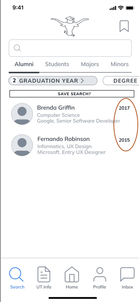
Imagine you are on the search page and wanted to filter your alumni search by "Graduation Years" of 2015 and 2017. Can you show me how you would do that and talk about it outloud?
Task 03
Saving a Search
Imagine you wanted to save the previous search you made with the filtering settings you applied (Alumni & Graduation Years) and be able to find them all in one place. Can you show me how you would do that and talk about it outloud?
Task 04
Editing Saved Searches
Imagine you found where all your saved searches are but wanted to remove "UX Design" from saved searches. Can you walk me through what you would do and talk about it outloud?
Insights
We found certain flows needed better direction, results were confusing to distinguish, and several room for improvement
✓ What worked
• Navigation felt intuitive and easy to follow
• Search and filter functionality was clear
• Saving a search was discoverable
⚠ What needed improvement
• "Your subpage" was hard to find immediately
• Filtered results were confusing to distinguish
• Editing vs saving felt too similar to differentiate
• Users could only exit typing menu via Return key
High-Fidelity Prototypes
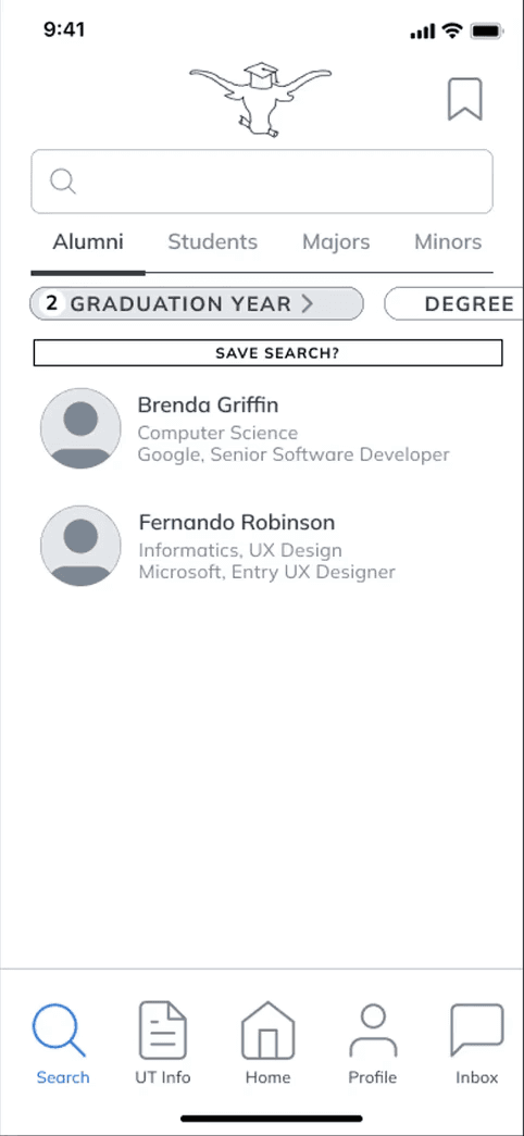
So we simplified language and actions to keep users moving forward, implemented signifiers to distinguish results, and underwent several rounds of iteration for further improvement
Font
Mulish
60%
Main Text
30%
Sub Text
10%
Bottom Menu Bar
Before
After
REFLECTION & NEXT STEPS
01
Research Often Reveals a Different Problem
Initially, we believed students primarily needed better information. Research revealed that students also needed access to people and lived experiences.
02
Information Alone Doesn't Create Confidence
Students frequently relied on conversations with peers, alumni, and advisors to validate decisions. Connection matters as much as content.
03
Testing Early Prevented Larger Problems Later
Usability testing exposed labeling and navigation issues before development, allowing us to improve clarity with relatively small design changes.
📊
Validate at Scale
Conduct additional usability testing with a larger and more diverse participant pool, including prospective students outside UT.
Find a way to measure confidence and how connections with alumni and students increase confidence in major decisions.
🕐
Test Longitudinal Usage
Because choosing a major can take months, evaluate how users interact with the platform over an extended period rather than a single session.
🎓
Partner With Academic Departments
Collaborate with advisors and departments to ensure information remains accurate and up to date.