Capital One Bank
Research and recommend a payment confirmation screen pattern based on content most needed by users and what builds confidence of success.
Role
UX Design Intern
Timeline
Summer 2025
Team
Become, Spend, & Pay / Payments Common Flow

Overview
Context
Within the Payments Domain workflows, customers see "Success" screens that appear immediately after money is moved. These screens don't have a common visual pattern and show different pieces of information across different payment methods
Bill Pay, Transfer, and Zelle — making it hard for users to feel confident their action completed successfully.
My Goal
Research and recommend a payment confirmation screen pattern based on the content most needed by users and what builds their confidence of success. By optimizing the bill payment experience first — the highest-risk flow — we could generalize findings to other payment methods.
My Impact
Researched and recommended a new payment confirmation screen pattern for Capital One's bill payment flow, directly shaping the product's design direction for Become, Spend & Pay.
Conducted a qualitative study with 8 users and a quantitative A/B test with 50 users to validate design decisions.
Directly informed the 2025 product strategy that allows users to feel confident in payment success.
This design work is subject to NDA. Ideas below are not shared for access.
View full case study here
(NDA Protected)

Research
There wasn't a set "standard" for content across payment confirmation screens.
Compared 10 major bank competitors for Bill Payment, Transfer, Deposit, and Zelle confirmation screens, plus 3 FAANG apps for general confirmation screens. Content generally consisted of: Check Mark / Confirmation Statement, Amount, From/To, Date, Frequency, Payment Type, Transaction/Confirmation #, Forward Action, Print/Save, Status, and Unique Features. We then pulled out the 5 most common patterns to run by users in Round 1 testing.

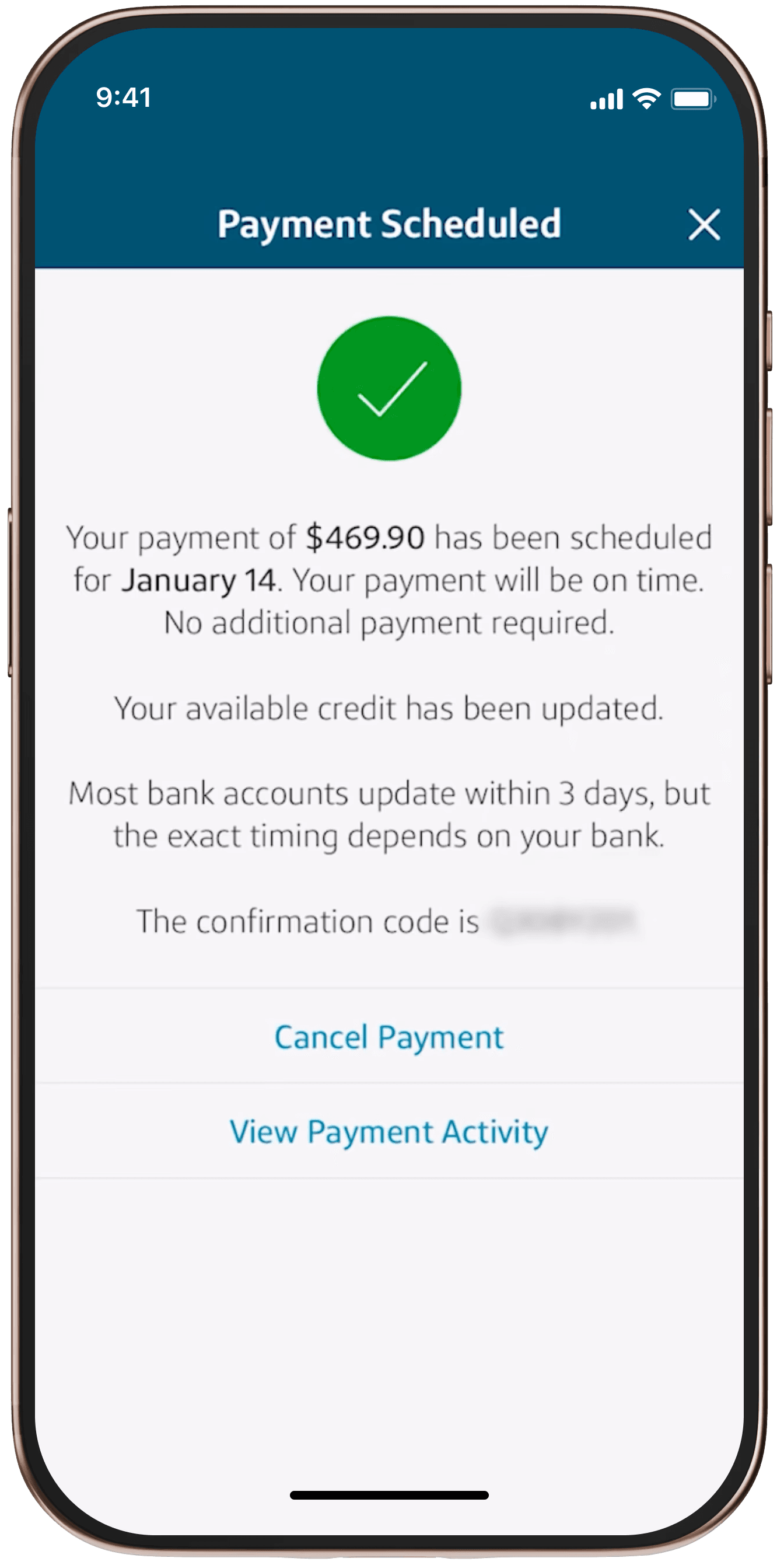
Example of previous payment confirmation screen
Example of previous payment confirmation screen
Information dense description, not easily digestable
Information dense description, not easily digestable
Industry standard signifiers
Industry standard signifiers
Specific, yet limited call to actions
Specific, yet limited call to actions
Insights
Round 1: Confirmation page information, placement, and type matters in different contexts
In initial insight interviews with users, we tested competitor confirmation screen patterns using card sorts and screen walkthroughs to identify the critical content and actions users need. Based on my findings, I focused on design and content strategy that surrounded
01 Understanding the amount of information provides confidence. Does a lack of detail makes them doubt their action went through? Does more information provide doubt?
02 In dynamic with understanding amount, what types of information land in these areas that are essential?
03 Are the common Call to Action buttons that appear on these pages what users need at this point in time?
04 Incorporating and rethinking industry standard imagery and popular elements not only for these kinds of interfaces but in these contexts/scenarios
How might we...
Design a confirmation screen that gives users the information they need to feel confident, while keeping the experience clean and digestible?
Usability · Testing
Users expressed which designs provided them what they needed when dependent on the context.
I conducted a total of 50 unmoderated user tests with users both who have used a variety of banking services both within and outside of Capital One.
Reflection
Key Takeaways
01 It's okay to fight for your ideas
If you truly believe in something, don't be scared to provide your reasons as to why. Advocating for a direction — even when it feels uncomfortable — leads to richer conversations and stronger outcomes.
02 Focus on one direction to gain rich insights
Instead of approaching our overall goal directly, we set our sights on one direction — bill payments — to gain rich insights rather than trying to capture too much at once and getting nothing. A focused scope led to findings we could confidently generalize.
03 Valuable insights require being mindful of limitations
Users' solutions don't automatically mean the right solution. 8 participants are valuable, but don't speak for the whole. Being mindful of research size, synthesis biases, and the difference between what users say and what they do made our final recommendations far more defensible.

Views from the NYC office!

Needed Capital One headquarters selfie with the design intern cohort
Keep reading...

Capital One Dealer Design
UX Design
Capital One Bank
Research and recommend a payment confirmation screen pattern based on content most needed by users and what builds confidence of success.
Role
UX Design Intern
Timeline
Summer 2025
Team
Become, Spend, & Pay / Payments Common Flow
Overview
Context
Within the Payments Domain workflows, customers see "Success" screens that appear immediately after money is moved. These screens don't have a common visual pattern and show different pieces of information across different payment methods
Bill Pay, Transfer, and Zelle — making it hard for users to feel confident their action completed successfully.
My Goal
Research and recommend a payment confirmation screen pattern based on the content most needed by users and what builds their confidence of success. By optimizing the bill payment experience first — the highest-risk flow — we could generalize findings to other payment methods.
My Impact
Researched and recommended a new payment confirmation screen pattern for Capital One's bill payment flow, directly shaping the product's design direction for Become, Spend & Pay.
Conducted a qualitative study with 8 users and a quantitative A/B test with 50 users to validate design decisions.
Directly informed the 2025 product strategy that allows users to feel confident in payment success.
This design work is subject to NDA. Ideas below are not shared for access.
View full case study here
(NDA Protected)
Research
There wasn't a set "standard" for content across payment confirmation screens.
Compared 10 major bank competitors for Bill Payment, Transfer, Deposit, and Zelle confirmation screens, plus 3 FAANG apps for general confirmation screens. Content generally consisted of: Check Mark / Confirmation Statement, Amount, From/To, Date, Frequency, Payment Type, Transaction/Confirmation #, Forward Action, Print/Save, Status, and Unique Features. We then pulled out the 5 most common patterns to run by users in Round 1 testing.
Example of previous payment confirmation screen
Information dense description, not easily digestable
Industry standard signifiers
Specific, yet limited call to actions
Insights
Round 1: Confirmation page information, placement, and type matters in different contexts
In initial insight interviews with users, we tested competitor confirmation screen patterns using card sorts and screen walkthroughs to identify the critical content and actions users need. Based on my findings, I focused on design and content strategy that surrounded
01 Understanding the amount of information provides confidence. Does a lack of detail makes them doubt their action went through? Does more information provide doubt?
02 In dynamic with understanding amount, what types of information land in these areas that are essential?
03 Are the common Call to Action buttons that appear on these pages what users need at this point in time?
04 Incorporating and rethinking industry standard imagery and popular elements not only for these kinds of interfaces but in these contexts/scenarios
How might we...
Design a confirmation screen that gives users the information they need to feel confident, while keeping the experience clean and digestible?
Usability · Testing
Users expressed which designs provided them what they needed when dependent on the context.
I conducted a total of 50 unmoderated user tests with users both who have used a variety of banking services both within and outside of Capital One.
Reflection
Key Takeaways
01 It's okay to fight for your ideas
If you truly believe in something, don't be scared to provide your reasons as to why. Advocating for a direction — even when it feels uncomfortable — leads to richer conversations and stronger outcomes.
02 Focus on one direction to gain rich insights
Instead of approaching our overall goal directly, we set our sights on one direction — bill payments — to gain rich insights rather than trying to capture too much at once and getting nothing. A focused scope led to findings we could confidently generalize.
03 Valuable insights require being mindful of limitations
Users' solutions don't automatically mean the right solution. 8 participants are valuable, but don't speak for the whole. Being mindful of research size, synthesis biases, and the difference between what users say and what they do made our final recommendations far more defensible.

Views from the NYC office!
Needed Capital One headquarters selfie with the design intern cohort
Keep reading...
Capital One Dealer Design
UX Design